Utochka Mobile App
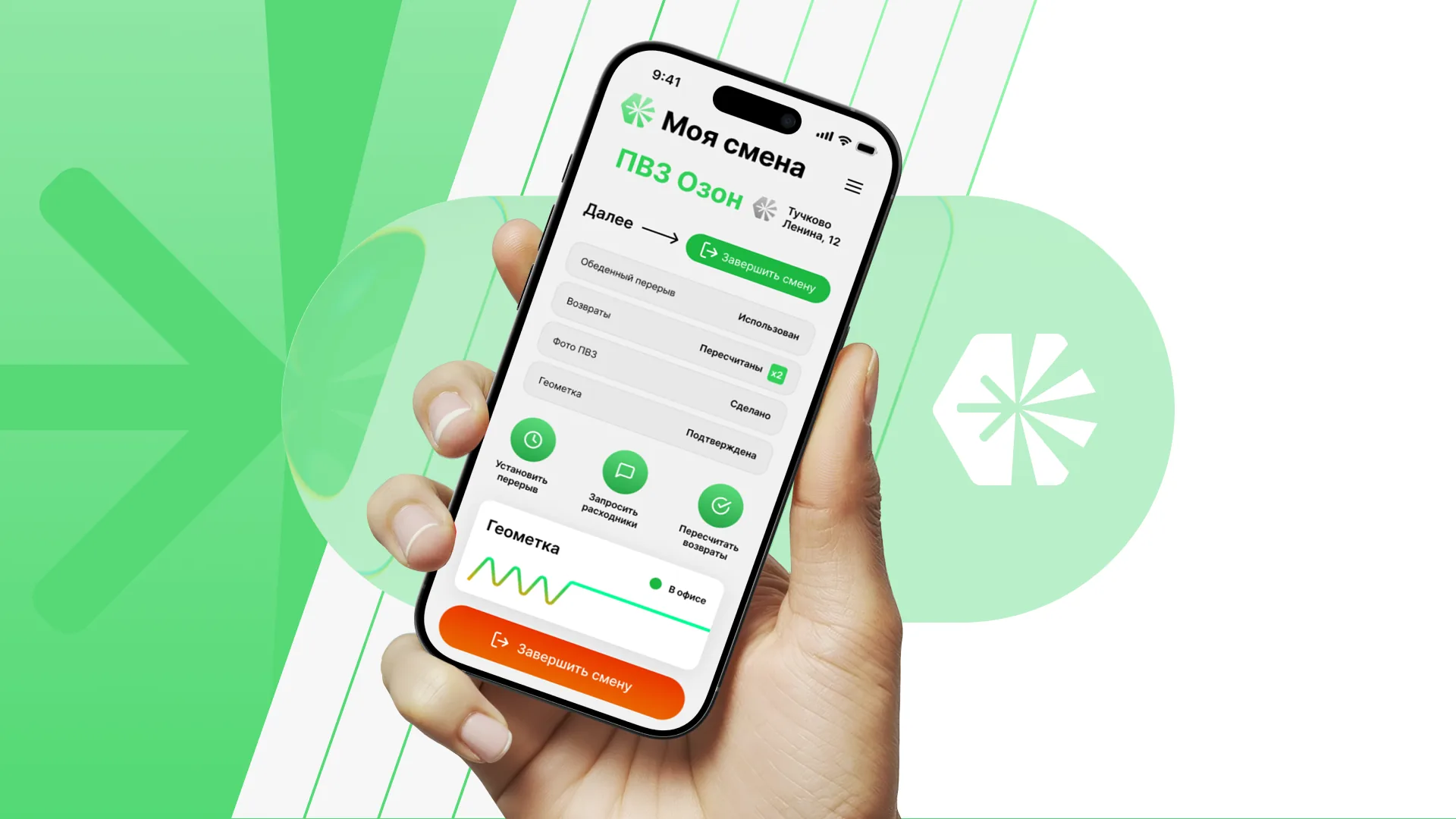
A mobile application for Utochka that turns daily staff routines into a clear operational flow: shift start, geolocation, supplies requests, lunch orders, photo proof, returns, and service states
Case study by Basil Artemov — Product Designer — discovery, branding, UX/UI, flow design, prototyping, and developer handoff
Client
Utochka
Period
2026
Platforms
iOS-first mobile app for field and shift operations
Role
Product Designer
discovery, branding, UX/UI, flow design, prototyping, and developer handoff
Work stages
core staff flows mapped end to end
mobile states prepared for implementation
compact brand and UI system handed off
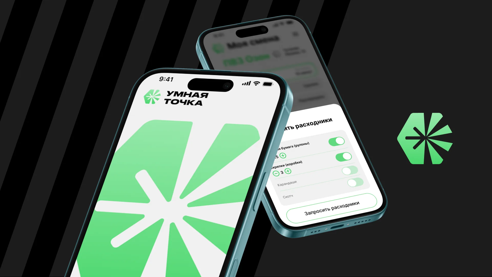
Interface gallery
 tap: zoom
Overview
Utochka is a mobile operations app for staff who need to move through repetitive field tasks quickly and without ambiguity. The product covers the practical moments around a shift: sign in, start work, confirm location, request supplies, open menu and lunch flows, capture photo proof, process returns, and understand current service states
The assignment was broader than making screens. The work included discovery, brand direction, UX/UI, flow design, prototyping, and a clean handoff so the client could move from concept to implementation without losing product logic along the way
tap: zoomBusiness Context
Operational apps fail when they ask field teams to think too much. Utochka needed a mobile product that could be used during a shift, in a hurry, and in situations where the user is not sitting calmly at a desk
That meant the interface had to be direct, high-contrast, and forgiving: short actions, visible state, understandable errors, and a brand system that creates recognition without slowing down the work
Discovery
The discovery phase translated informal operational routines into a structured product map. I separated entry, shift start, geolocation, supplies, menu, lunch, photo proof, returns, and service states into flows that could be designed and tested independently
This helped expose where the product needed hard confirmation, where it needed fast one-tap action, and where the user needed feedback rather than another screen
- Mapped daily staff routines into product scenarios
- Separated shift, service, supplies, photo, and return flows
- Defined empty, disabled, warning, and success states early
- Turned operational edge cases into clear interface requirements
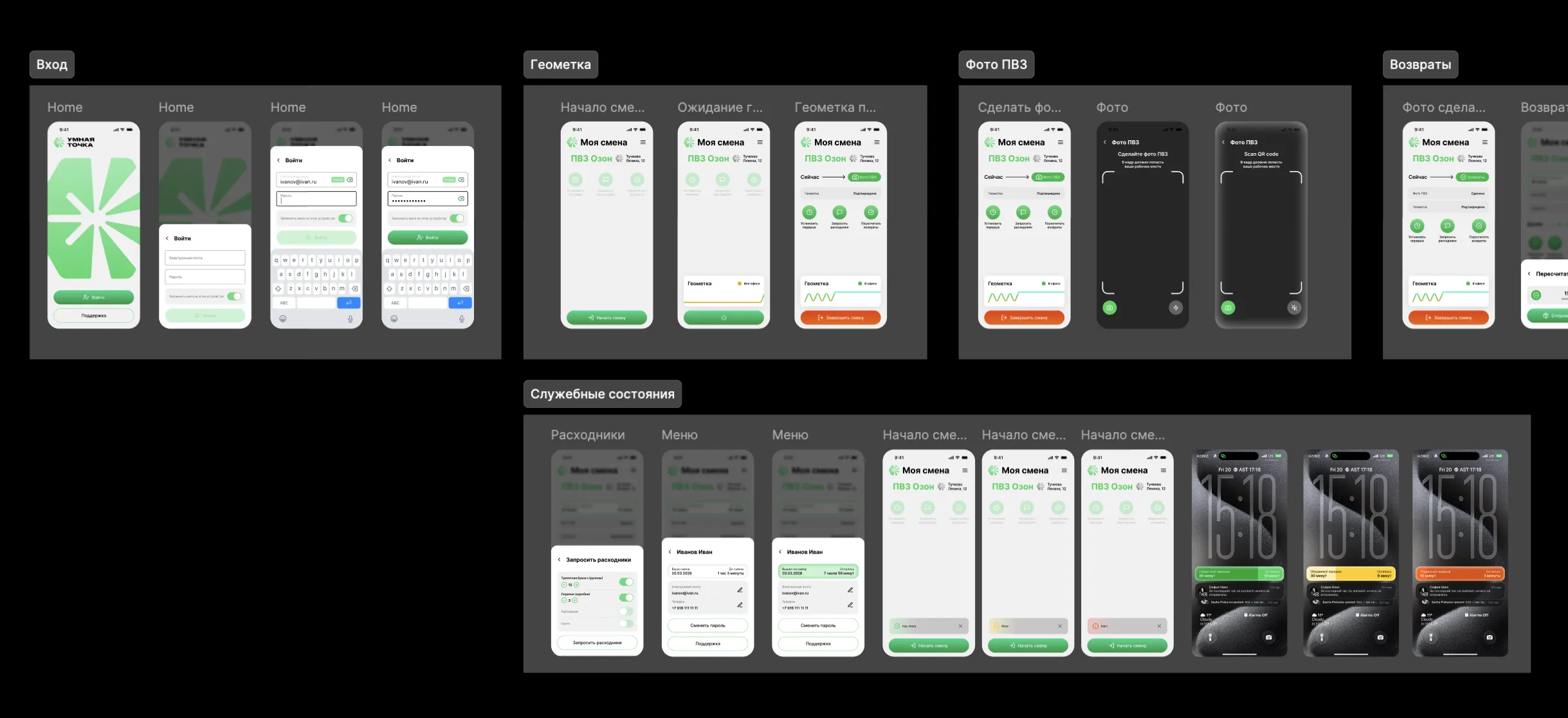
UX Flow
The app is built around a simple principle: the next action should always be obvious. Every workflow was reduced to a short sequence with one primary action, clear status feedback, and a visible path back
The flow board became the backbone of the project. It connected login, shift status, geolocation, request flows, menu states, lunch states, camera capture, QR scanning, returns, and service notifications into one coherent mobile system
 tap: zoom
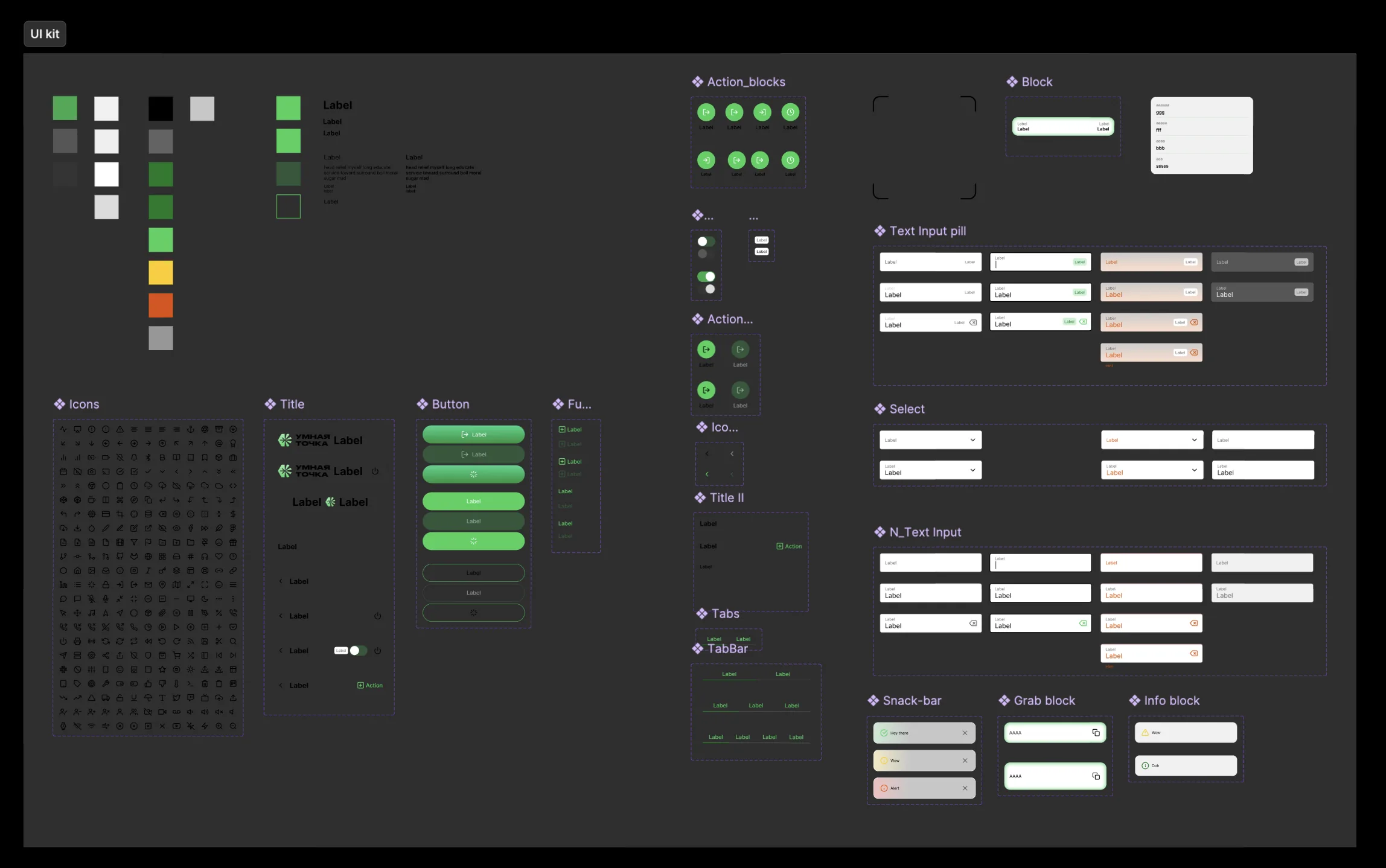
Branding & UI System
The brand system uses a bright green symbol, strict monochrome surfaces, and compact rounded controls to make the app feel recognizable but still operational. The goal was not a decorative brand world, but a practical identity that works inside repetitive staff tasks
The UI kit covered colors, typography, icons, buttons, tabs, input pills, blocks, action controls, snackbars, alerts, toggles, and service cards. That gave development a reusable system instead of isolated mockups
- Bright green brand accent with strong black-and-white contrast
- Reusable action blocks, input pills, snackbars, alerts, and toggles
- Mobile-first components sized for quick use during a shift
- A visual language that keeps branded moments and utility in balance
 tap: zoom
Prototyping
The prototype focused on rhythm: how fast the user understands the current state, taps the next action, gets confirmation, and returns to the work surface
That was especially important for geolocation, photo capture, QR scan, supplies, and return flows because these tasks depend on the physical context around the user, not only the screen itself
 tap: zoom
Handoff
The handoff packaged the brand direction, UI kit, flow logic, screen states, and interaction rules so the implementation team could build without guessing how screens relate to each other
The important part was preserving product intent: when a button is disabled, when a state is pending, when a warning appears, what confirms success, and where the user goes next
 tap: zoom
Outcome
The result is a compact, implementation-ready mobile app system for Utochka: branded enough to be memorable, pragmatic enough for field work, and structured enough for development
This case shows the full product-design scope behind a client mobile app: discovery, UX architecture, flow design, branding, UI system, prototype logic, and handoff discipline