idobeauty.ru
A responsive beauty brand website for idobeauty.ru with a bold visual system, product storytelling, partner purchase paths, salon-focused B2B content, UGC framing, and customized template implementation built to make a niche nail product feel premium, memorable, and commercially clear
Case study by Basil Artemov — Product Designer & Frontend Developer — art direction, responsive web design, custom template implementation, product storytelling, B2C partner flow, B2B salon flow, and launch polish
Client
i do beauty
Period
2026
Platforms
Responsive product website on a template-based CMS
Role
Product Designer & Frontend Developer
art direction, responsive web design, custom template implementation, product storytelling, B2C partner flow, B2B salon flow
Work stages
live beauty product website launched
commercial flows for buyers and salons
responsive interface scenes prepared
Interface gallery
 tap: zoom
Overview
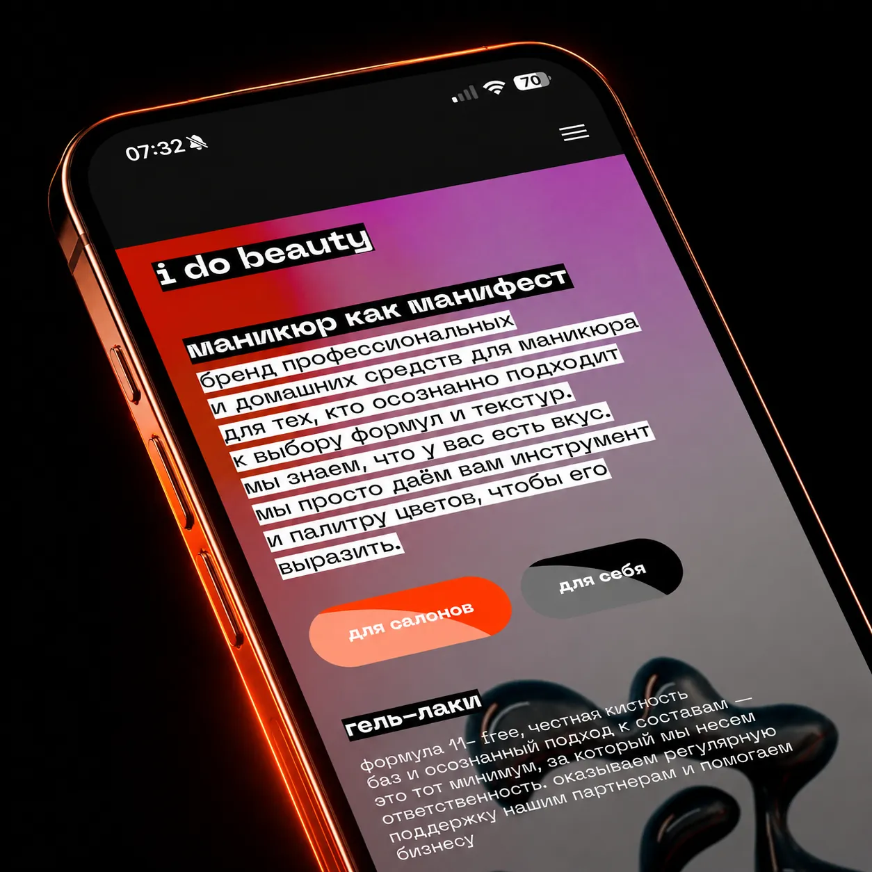
idobeauty.ru is a responsive product website for a nail-care beauty brand. The project needed to feel more expressive than a standard cosmetics landing page while still giving visitors clear routes to understand the product, buy through official partners, and contact the brand for salon cooperation
The work combined art direction, responsive web design, content structure, customized template implementation, mobile polish, and SEO-conscious page structure. The result is a launch-ready brand website with enough visual character to be remembered and enough commercial clarity to work as a sales surface
 tap: zoom
Business Context
Beauty products live in a crowded market where a site cannot rely on product photos alone. The brand needed a memorable visual language, a clear explanation of the product promise, and separate routes for regular buyers and salon owners
The website also needed to support the way the product is actually sold: not as a single generic checkout, but through official partners, marketplace routes, consultation requests, and salon-focused cooperation conditions
Design Process
The process started from brand framing and page hierarchy: what the visitor needs to understand first, where trust is built, where purchase intent appears, and how salon owners should be routed without confusing regular buyers
The template platform was treated as an implementation base, then customized around a sharper visual system, mobile-first content blocks, sticky commercial actions, product imagery, and sections that can carry both emotional brand language and practical conversion copy
- Brand and product-message framing
- Mobile-first page structure and CTA hierarchy
- Custom template implementation and responsive polish
- Separate buyer and salon-owner conversion paths
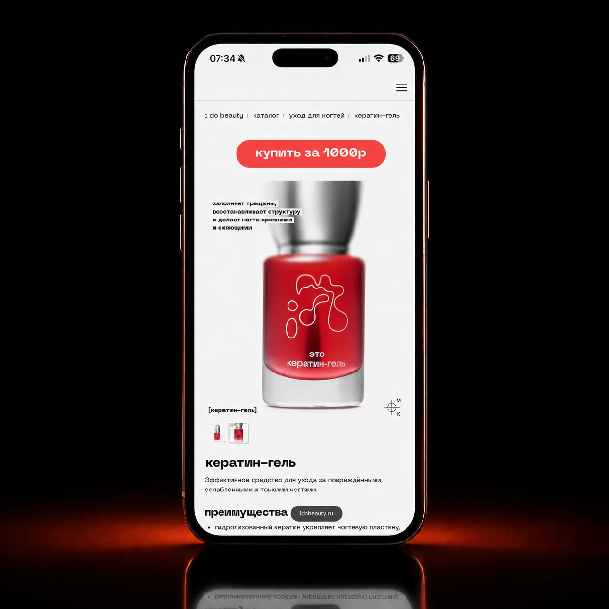
Product Storytelling
The product needed to be explained through a mix of visual recall and concrete usefulness. The site uses bold contrast, product compositions, short claim blocks, and benefit-led sections to make the nail-care offer easy to recognize and easy to retell
Instead of hiding behind generic beauty language, the page gives the product a distinctive rhythm: expressive visuals, direct headlines, partner purchase blocks, and practical product detail for visitors who are ready to compare before buying
- Strong product recognition through packaging and color
- Benefit blocks written for quick scanning
- Visual contrast between premium polish and rough editorial energy
- Product detail preserved on mobile screens
 tap: zoom
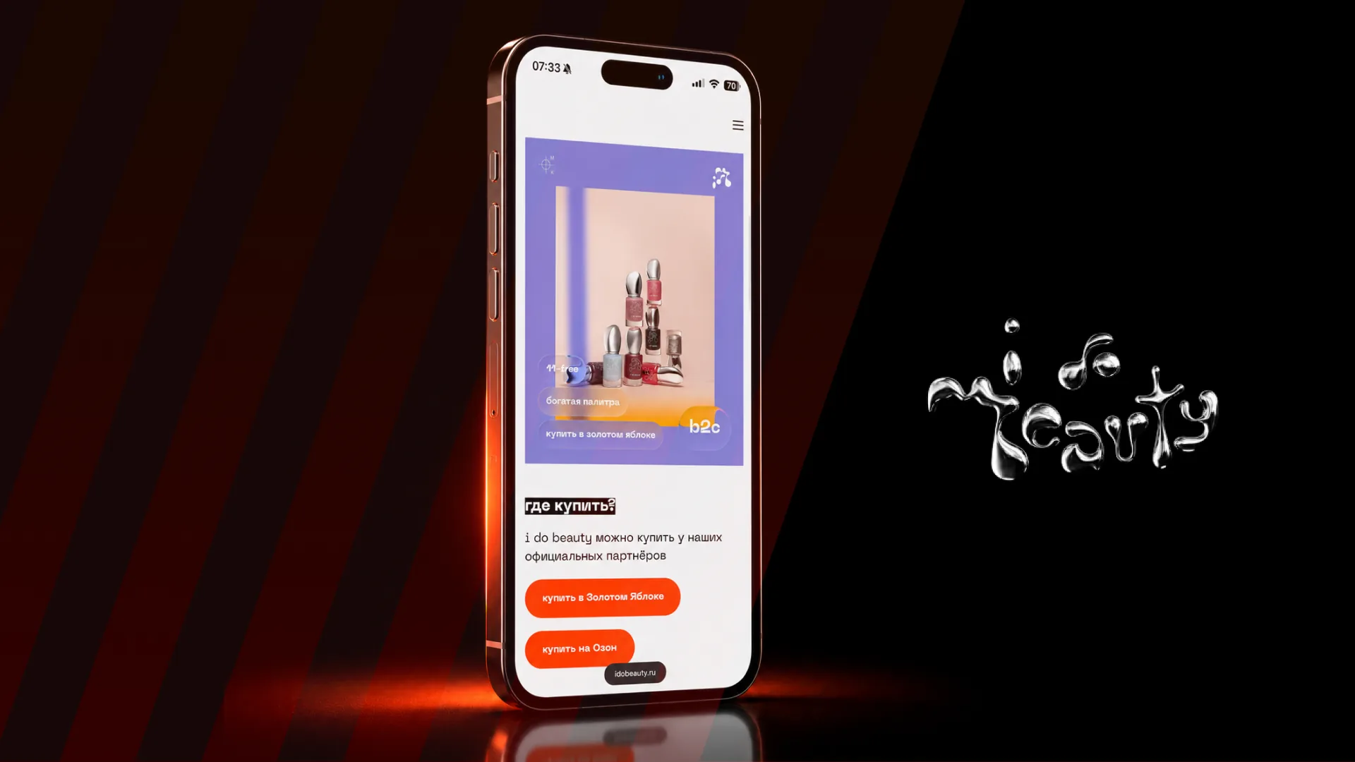
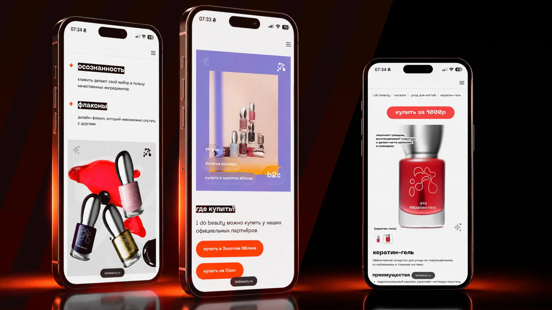
Purchase Paths
The commercial layer was designed around partner purchase routes rather than a heavy native shop. Visitors can understand where the product is available and move toward official buying channels without losing the brand context
This matters for SEO and conversion because the site can act as the canonical brand surface: it explains the product, frames trust, and then sends demand into partner routes with clear calls to action
- Partner routes surfaced as explicit purchase actions
- Commercial CTAs kept close to product explanation
- Marketplace and retail paths separated from brand storytelling
- No unnecessary checkout friction inside the brand page
 tap: zoom
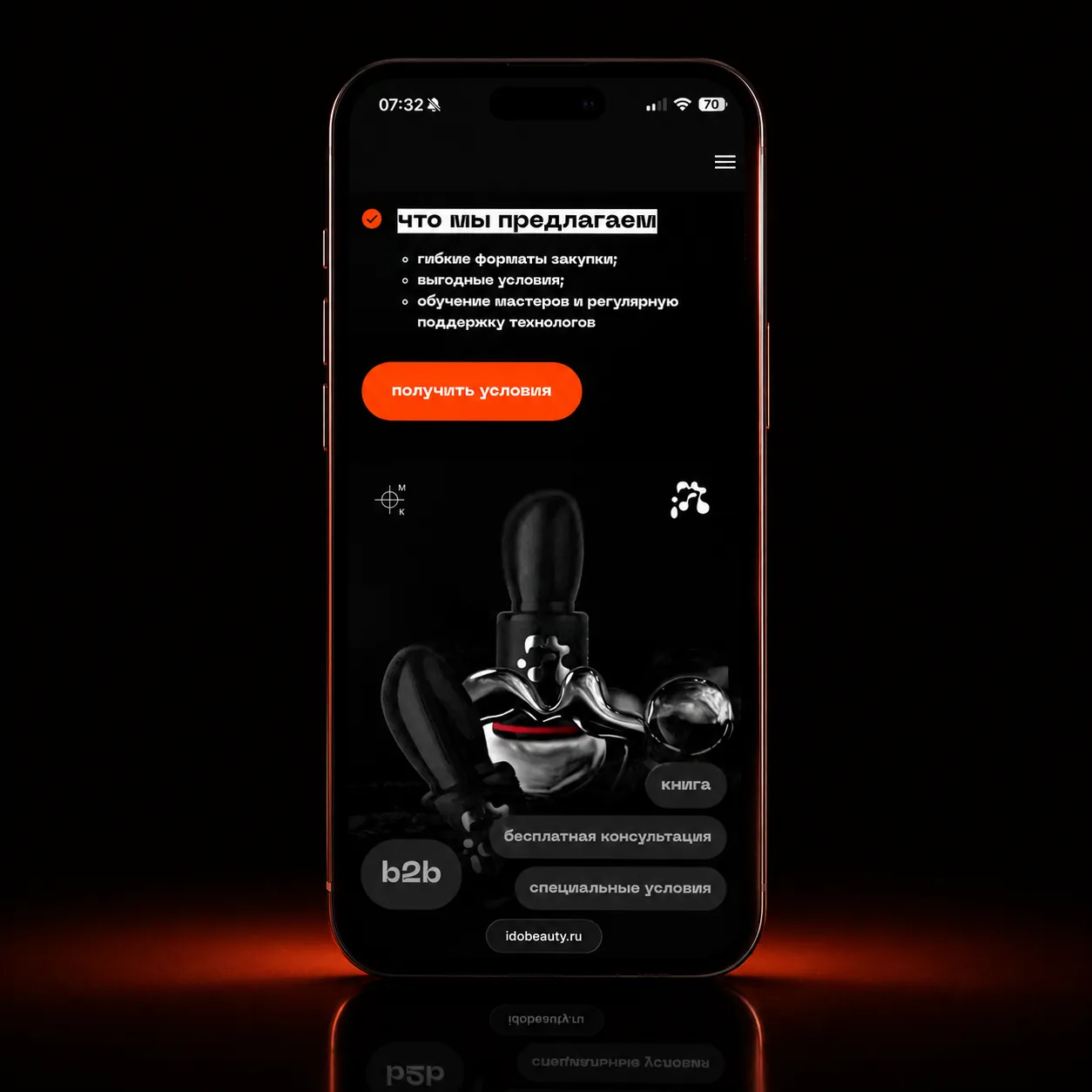
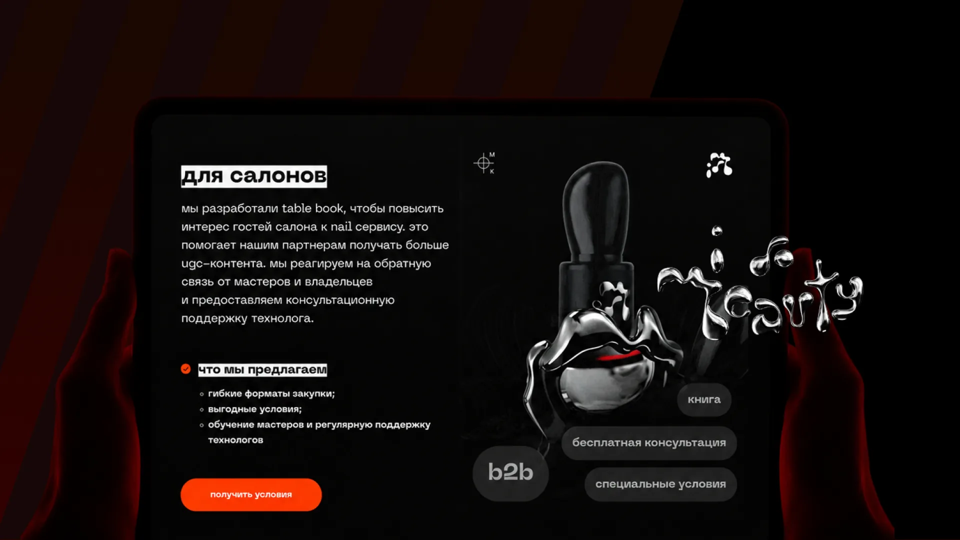
Salon B2B Flow
The salon layer needed a different tone from the buyer path. For salon owners and masters, the site explains cooperation value: flexible purchasing formats, conditions, education, support, and consultation with a technologist
That B2B flow gives the website a second commercial job. It is not only a brand page for end customers, but also a lead-generation surface for professional partnerships and salon adoption
- Salon-specific value proposition
- Consultation and conditions as primary actions
- Support and training framed as business benefits
- Professional path separated from consumer purchase routes
 tap: zoom
Mobile Experience
The site is intentionally mobile-forward because beauty discovery, social traffic, and partner clicks often happen from the phone. The mobile version keeps product imagery large, headlines sharp, and CTAs easy to hit
The interface avoids becoming a long decorative poster by keeping each section tied to an action: understand the product, check benefits, buy from a partner, or request salon conditions
 tap: zoom
Development & Delivery
The implementation was done inside a template-based site system, with custom layout behavior, responsive tuning, image optimization, content rhythm, and launch polish layered on top of the platform constraints
SEO was handled through clear page hierarchy, product-focused copy, descriptive media, canonical live product URL, indexable content, and a case structure that can explain the business role of the site beyond visuals
Outcome
The final result is a live beauty brand website that gives idobeauty.ru a distinctive digital presence, supports product understanding, routes customers to official purchase channels, and gives salons a clear path to cooperation
The case shows how brand expression, product design, responsive web implementation, partner commerce, and B2B lead logic can work together inside a focused beauty website without turning it into a generic landing page