Astronautica
A personal astrology service designed as a contemporary product platform with daily guidance, natal analytics, compatibility features, and fast-moving visual storytelling. The live product is available at app.basilarcana.com
Case study by Basil Artemov — Founder — product vision, service strategy, UX architecture, feature design, launch scope, brand direction, and go-to-market packaging
Client
Astronautica
Period
2026
Platforms
Mobile product and web entry surfaces
Role
Founder
product vision, service strategy, UX architecture, feature design, launch scope, brand direction
Work stages
weeks from concept to launch-ready platform
core product surfaces designed as one system
clear product story across astrology, ritual, and daily guidance
Interface gallery
 tap: zoom
Overview
Astronautica was conceived as a contemporary personal astrology service rather than a generic horoscope app. The goal was to build a sharper daily product around insight, ritual, and premium self-discovery
I designed the service as a coherent platform with a strong product language, faster decision-making, and enough depth to compete with category leaders such as Co–Star while still feeling more structured and more useful day to day. The live product can be explored at app.basilarcana.com
Business Context
The astrology category is crowded with noisy, decorative products that over-index on vague mysticism and underdeliver on clear everyday value. The opportunity here was to build a product that feels premium, habit-forming, and operationally stronger
The product needed to move fast, establish a clear market position, and combine multiple value layers into one system: daily guidance, compatibility, windows of opportunity, natal analytics, and content depth
Design Process
I started by reviewing category leaders and adjacent ritual products to understand where the market was over-styled, repetitive, or weak in actual retention mechanics
From there I defined a tighter information model, a cleaner visual system, and a compact launch scope that could still feel like a complete premium platform rather than an MVP with obvious gaps
As founder, I drove the product framing, shaped the service strategy, prioritized the release scope, supervised the brand language, and aligned the platform around a launch story strong enough to feel credible from day one
- Competitive review across astrology leaders and adjacent ritual apps
- Product framing around stronger daily value and repeat usage
- Fast concept-to-system design with a unified visual language
- Launch planning around the few features that most strongly shape habit and retention
Product Strategy
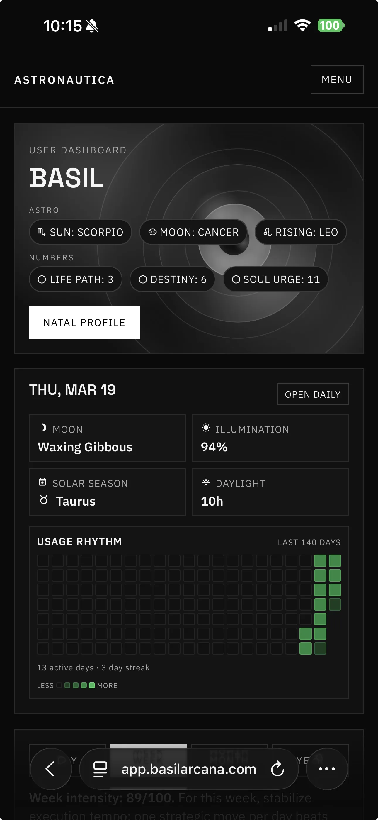
The product was structured around a central dashboard that keeps the user oriented, with supporting surfaces for daily signal, compatibility, numerology, ritual content, and deeper profile analysis
A big part of the strategy was making astrology feel more like a readable system than an opaque feed of mystical fragments. That meant clearer hierarchy, stronger status framing, and more confident interaction patterns
Key Features
Several features were designed to make the service stand out in a category where many products feel interchangeable
- Compatibility views designed around friends and interpersonal dynamics
- Daily windows of opportunity to create a stronger time-based product rhythm
- More advanced natal chart surfaces with clearer analytical framing
- Editorial insight and ritual layers that add depth without turning the app into a blog
tap: zoom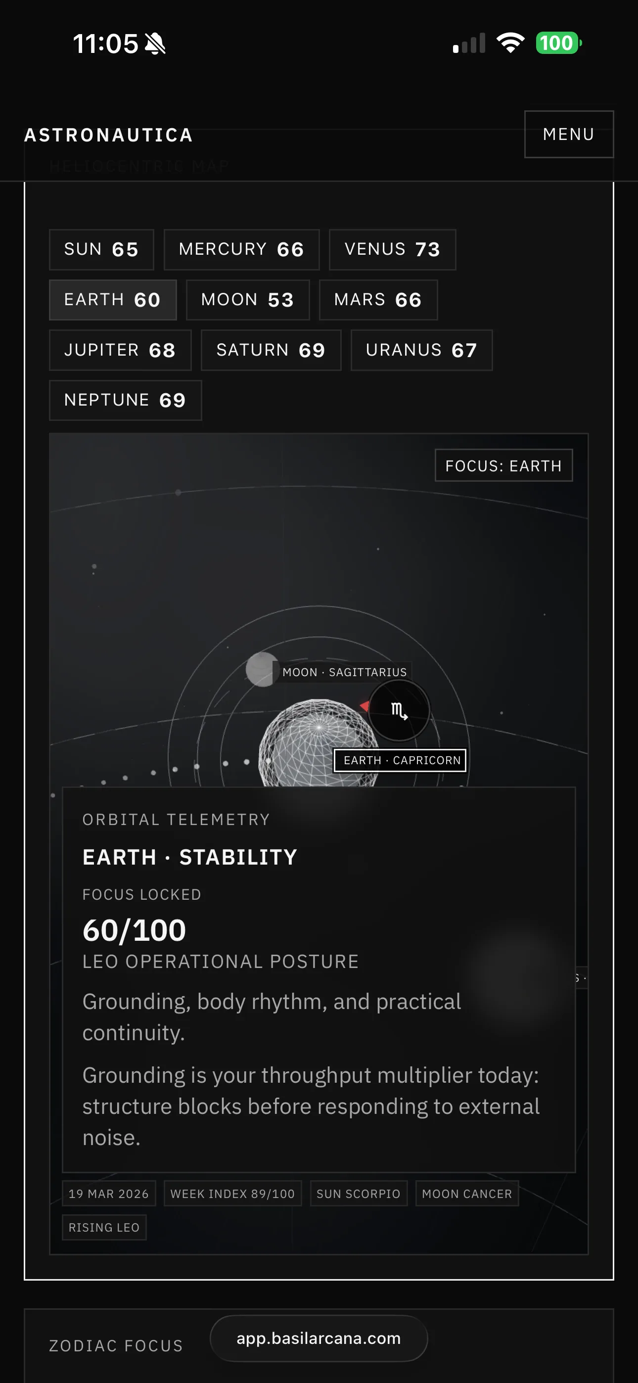 tap: zoom
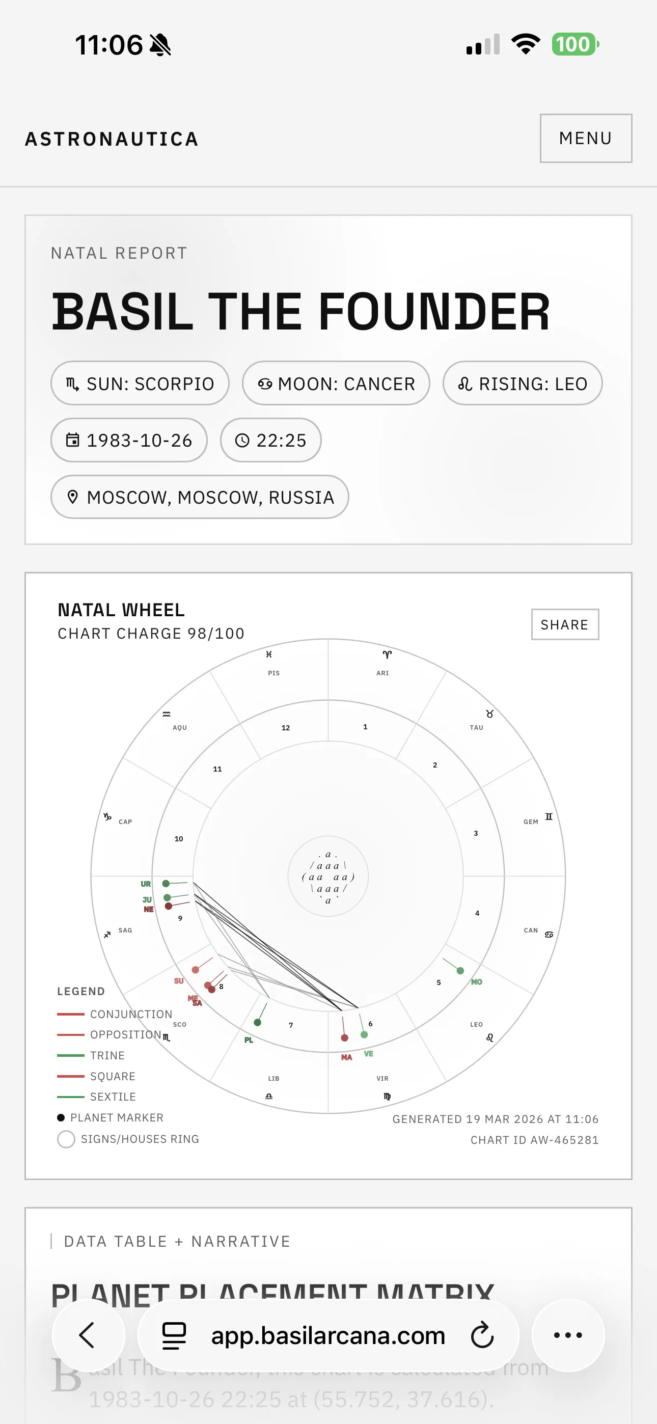 tap: zoom
Outcome
The result was a launch-ready astrology platform with a stronger system feel, more premium daily value, and a clearer reason to return beyond generic horoscope content
This case shows how I can analyze a crowded consumer category, move fast, and still assemble a platform that feels strategically positioned, visually coherent, and ready to compete at the top of the space. The live product can be explored at app.basilarcana.com